
Time for an overhaul!
After many years with minimal marketing, Arbré approached Pro Artwork to give their brand a facelift. The brief guidelines was to be more of a brand evolution rather than completely different look. With that in mind, the logo was slightly modified but the packaging and marketing materials were updated with a new and fresher look. By choosing a colour for each product family, it enabled product recognition at a glance. Templates were created for newsletters and brochures to keep styling consistent and now Arbré has a continuity through the 130 products they sell with consistent marketing materials to back it up. Their stationery and website has also been updated to reflect the new style, giving the overall brand a premium look and feel.
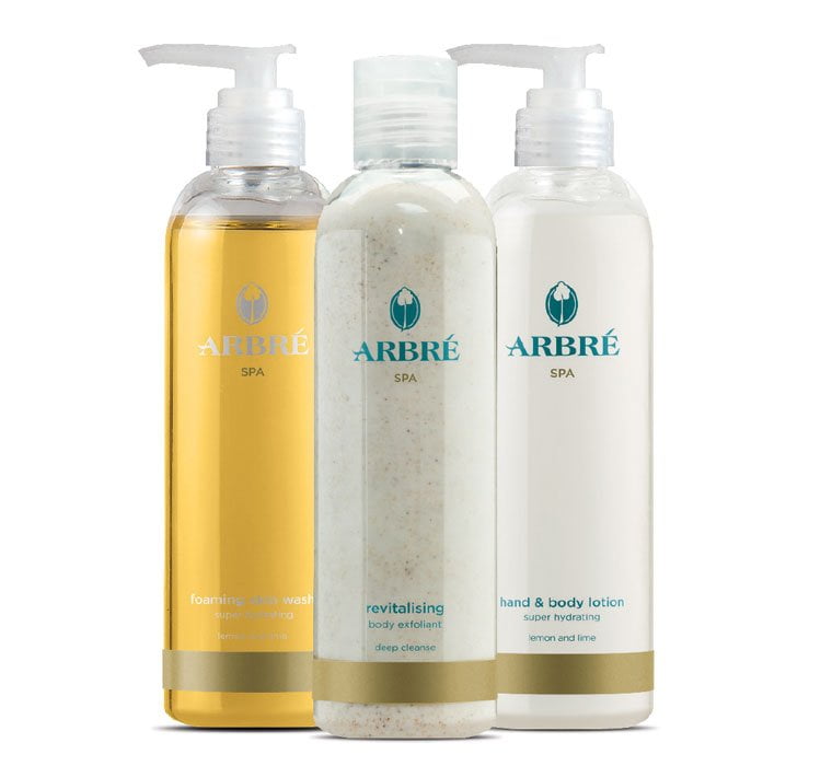
Bottle Updates
The first items to change were the bottles. Adding a colour bar at the base of each bootle represented one of the seven product families. Minimal text on the front made for clutter free reading enabling each product to be recognised at a glance.
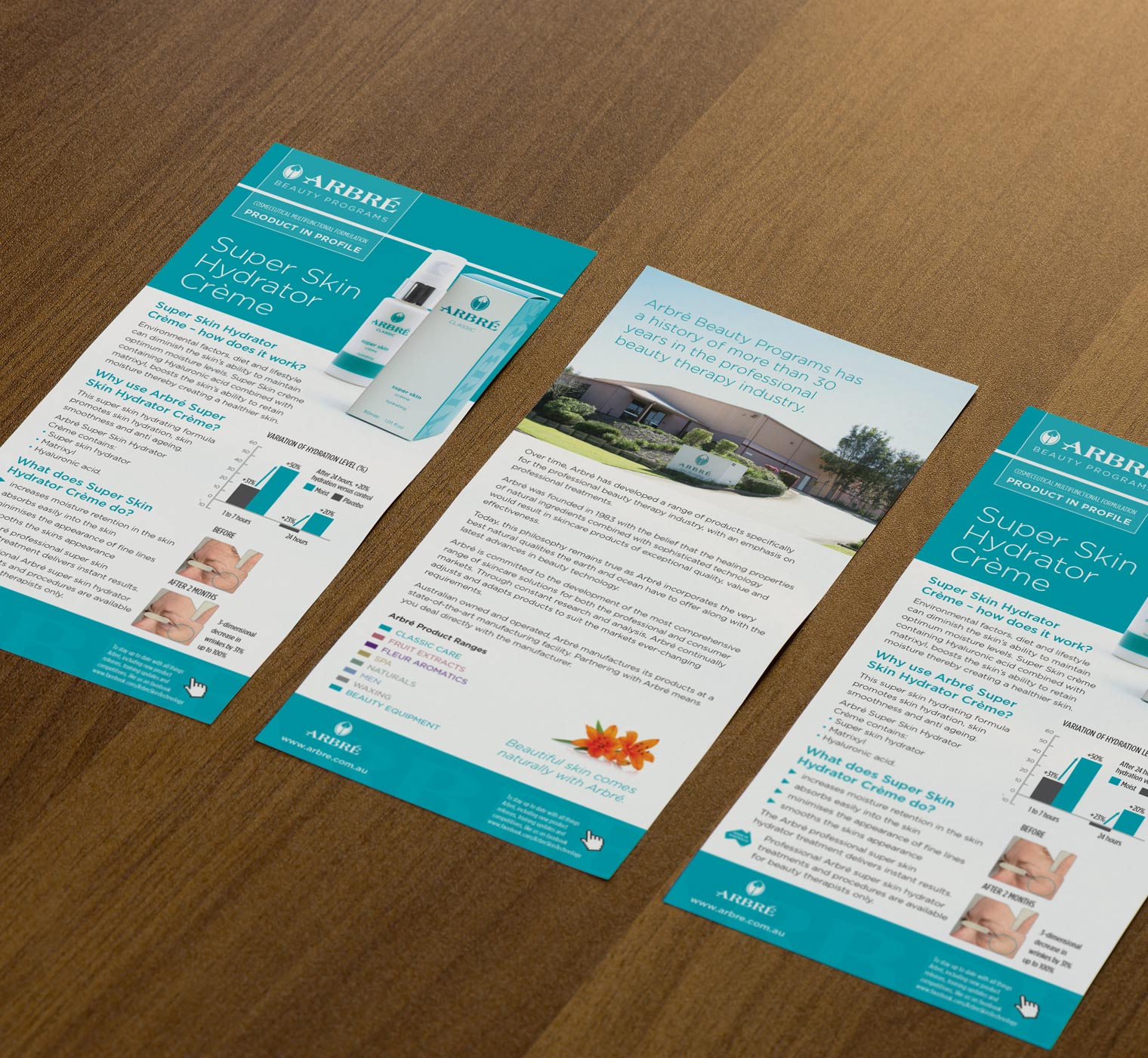
Flyers
A consistent design was created for all marketing materials. Starting with the company brochure, we moved on to individual items such as flyers, posters, newsletters, training manuals and the website. The updated style has brought Arbré into the 21st century.
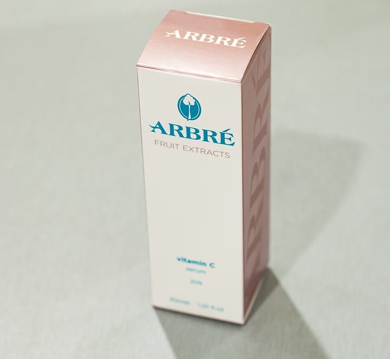
Box Design
Some of the bottles required boxes. A new layout was created that emphasised the family colour around the outer edges and printed metallic with a gloss UV varnish and a reversed matt logo on one side. The box face mimicked the typography of the bottle inside.
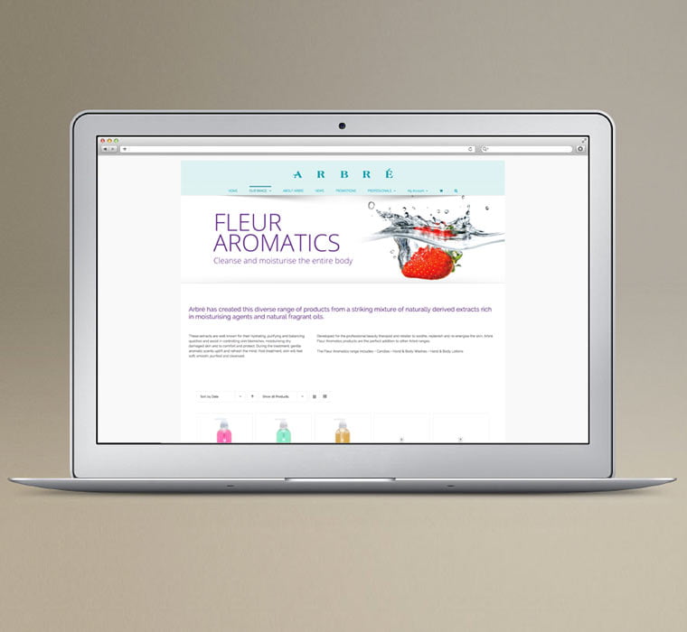
Website Design
Finally the website had a major overhaul. The design has remained consistent with all print media and navigation has been simplified making it easier for clients to find what they are after. E-commerce facilities have also been added for online sales.